gganimate vs. plotly - Which is better at animation?
March 22, 2018
RWhen I was in school, I always found that the blackboard was the best teaching tool (as opposed to say a pre-prepared static slide in PowerPoint). As a student, I found it really helpful to see a concept get built up from nothing, and accordingly when I was a teaching assistant in economics, I also preferred using the blackboard to build up concepts together with my students (I also found it more fun as it was now a collaborative experience). Now in the business world, developing concepts is still as important as when I was in school, but using a blackboard will likely get me… looks… Luckily, there’s a very neat alternative: the animation!
I’ve been trying two methods with animations:
- Method 1:
gganimate&tweenr - Method 2:
plotly
Let’s build a quick demo of each!
Dataset
This post will be more on creating animations, rather than focus on the specific dataset being animated. Having said that, an interesting dataset will make this all the more exciting.
Lately in Canada, there has been some concern over the number of babies the country is producing. We shall then take a look at how income per person has been affecting the number of children women have given birth to throughout the years across all regions around the world.
Pulling in the data
We’ll begin with downloading the data.
I’m going to do some data cleanup but I will skip the code to keep this post more brief.
[…data cleanup…]
After the data cleanup, we will join all the datasets together for one unified set:
# Join datasets
data.join <- left_join(data.income.clean, data.babies.clean) %>%
left_join(data.pop.clean) %>%
left_join(data.region.clean)
data.join[complete.cases(data.join),] -> data.joinHere’s a random sample of what 10 data points look like:
| country | year | income | babies | pop | region |
|---|---|---|---|---|---|
| Ethiopia | 1995 | 578 | 7.00 | 57237226 | Sub-Saharan Africa |
| Nepal | 2013 | 2173 | 2.30 | 27834981 | South Asia |
| Nepal | 1995 | 1405 | 4.71 | 21390905 | South Asia |
| West Bank and Gaza | 1979 | 2144 | 7.39 | 1469730 | Middle East & North Africa |
| Togo | 2003 | 1235 | 5.11 | 5283246 | Sub-Saharan Africa |
| Nepal | 1800 | 654 | 6.15 | 3881000 | South Asia |
| St. Vincent and the Grenadines | 1967 | 2611 | 6.49 | 87736 | Latin America & Caribbean |
| Niger | 1996 | 809 | 7.77 | 9701730 | Sub-Saharan Africa |
| Romania | 1991 | 10059 | 1.56 | 23454143 | Europe & Central Asia |
| Ireland | 2000 | 41198 | 1.95 | 3841574 | Europe & Central Asia |
Method 1: gganimate with tweenr
First up, is a combo-solution that directly extends the ggplot2 universe: the package gganimate developed by David Robinson (@drob) along with the package tweenr developed by Thomas Lin Pedersen (@thomasp85).
Let’s develop this animation.
library(gganimate)
library(tweenr)
# Tween for smoother animations
data.join.tween <- data.join %>%
rename(x = income,
y = babies,
time = year,
id = country) %>%
mutate(ease = "linear") %>%
select(-region) %>%
tween_elements("time", "id", "ease", nframes = 1000)
# Re-add prior data
data.join.tween <- inner_join(data.join.tween,
data.region.clean,
by = c(".group" = "country"))
# Plot
p <- ggplot(data.join.tween, aes(x = x, y = y)) +
geom_point(aes(size = pop, frame = .frame, colour = region),
alpha = 0.7) +
xlab("GDP per capita") +
ylab("Number of Babies Born per Woman") +
theme_minimal(base_size = 16) +
geom_smooth(aes(group = .frame, frame = .frame), method = "loess",
color = "black", linetype = "dashed",
se = F, size = 0.5) +
theme(legend.position="none") +
scale_x_log10(labels = dollar) +
scale_size_area(guide = FALSE, max_size = 20) +
scale_color_brewer(name = "", palette = "Set2") +
facet_wrap(~region)
# Animate Plot
gganimate(p, title_frame = T, interval = 0.02, "../../static/img/gganimate.gif",
ani.width = 800, ani.height = 800,
ani.res = 90) #<- Not run to save render time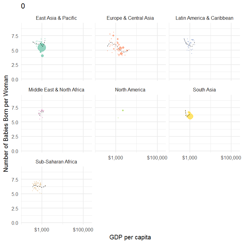
Voila, a pretty nice looking animated graph if I may say so myself 😃.
Method 2: plotly
The second method is via the plotly package, developed by a Canadian company of the same name.
Plotly also has a function which allows you to translate a ggplot2 graph into a plotly graph which we will use below.
# Generate base ggplot2 graph
p2 <- ggplot(data.join, aes(x = income, y = babies)) +
geom_point(aes(size = pop, frame = year, colour = region, group = country),
alpha = 0.7) +
xlab("GDP per capita") +
ylab("Number of Babies Born per Woman") +
theme_minimal(base_size = 10) +
geom_smooth(aes(group = year, frame = year), method = "loess",
color = "black", linetype = "dashed", se = F, size = 0.5) +
theme(legend.position="none") +
scale_x_log10(labels = dollar) +
scale_size_area(guide = FALSE, max_size = 20) +
scale_color_brewer(name = "", palette = "Set2") +
facet_wrap(~region)
# Create plotly graph
ggplotly(p2, height = 900, width = 700) %>%
animation_opts(frame = 200,
easing = "linear",
redraw = FALSE)Conclusions
Animations - I find that these are two good methods for creating animations. The gganimate option is ideal for offline animations, while I tend to prefer the plotly solution if I’m posting to a website. The vector graphics and built-in smoothing are very nice touches by Plotly, but most importantly, the popup detail when you move your mouse over a ball was crucial to helping me understand what’s going on with the data.
Looking at the data, I found it particularly interesting to see China (the biggest ball in the East Asia region) bounce around so much, and goes to show how drastic the Great Famine was in 1959 - 1961, and also how effective the One Child Policy was after it was introduced in 1979.
Outside of those shocks to China, it seems that for the most part the number of babies born had a distinct negative relationship with the amount of income for all regions.