Logs to the rescue! - model comparisons
November 21, 2017
modelling RWhile developing my hybrid financial model, I quickly realized that I needed a quick visual method to compare my new model performance with the traditional manual model currently in use by BMO.
I decided to focus first and foremost on model prediction accuracy (partly because there really is no comparison on speed… the hybrid model is fast!). The most obvious measure here, and it was one that I ran with for a while, is the absolute percentage error between the model predictions and the actual value.
As an example, suppose the actual value is 100, and Model A predicted 102, while Model B predicted 105. The absolute percentage error (APE) will simply be the distance between the prediction and the actual value, as a percentage of the actual value (in this case 100), without regard to whether the prediction was over or under.
library(tidyverse)
# Generate results
results <- data.frame(Actual = 100, Model.A = 102, Model.B = 105)

# Calculate APE
results$APE.A <- with(results, (Model.A / Actual - 1) %>% abs())
results$APE.B <- with(results, (Model.B / Actual - 1) %>% abs())

# Show results
results
## Actual Model.A Model.B APE.A APE.B
## 1 100 102 105 0.02 0.05As shown above, the further the prediction is from actual, the greater the APE value is. Now, instead of looking at two numbers, I made it so that I simply subtracted the two APE values, so that if the APE difference is negative then Model B is better, and conversely if the APE difference is positive then Model B is worse.
results$APE.diff <- with(results, APE.B - APE.A)

results
## Actual Model.A Model.B APE.A APE.B APE.diff
## 1 100 102 105 0.02 0.05 0.03As you can guess from this rather trivial example, Model B is worse since the APE difference is positive. In addition to seeing whether Model B is better or worse, we can also see how much better or how much worse Model B is by the magnitude of the APE difference.
Let’s see how this works with a variety of accuracies. First the data:
# Generate data
results <- data.frame(Actual = rep(100, 20),
                      Model.A = rep(105, 20),
                      Model.B = c(seq(50, 150, length.out = 18), 100.001, 300),
                      Date = 2017: (2017+19))

# Calculate APE
results$APE.A <- with(results, (Model.A / Actual - 1) %>% abs())
results$APE.B <- with(results, (Model.B / Actual - 1) %>% abs())
results$APE.diff <- with(results, APE.B - APE.A)

# Plot values
ggplot(results, aes(x = Date)) +
        geom_line(aes(y = Actual, linetype = "Actual")) +
        geom_line(aes(y = Model.A, linetype = "Model A")) +
        geom_line(aes(y = Model.B, linetype = "Model B")) +
        ylab("Values") +
        theme_minimal()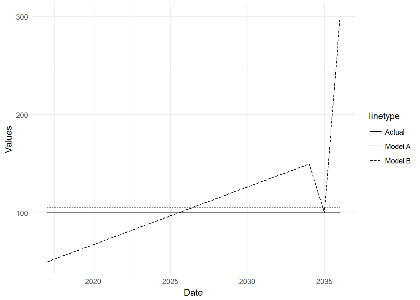
To summarize, the Actual values are a constant 100, Model A has a constant prediction of 105, and Model B has an escalating prediction, starting at 50.
Looking at our sole measure of which model is better, APE difference, shows us this:
ggplot(results, aes(x = Date, y = APE.diff)) +
        geom_bar(stat = "identity") +
        ylab("APE difference (Model B - Model A)") +
        theme_minimal()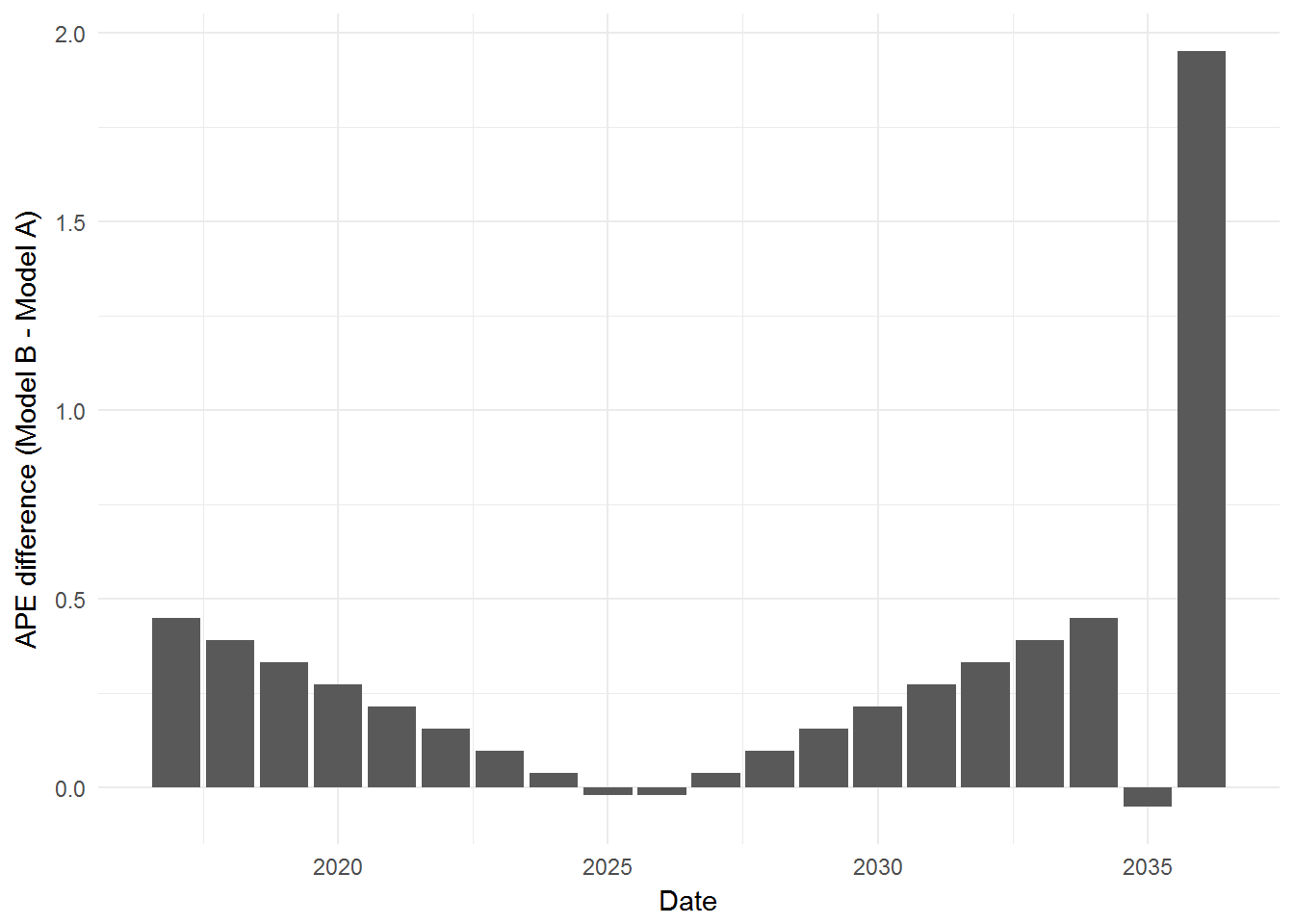
The above graph shows the performance of Model B, compared with Model A at various predictions. The bigger the upward bar, the worse off Model B is, and the bigger the downward bar, the better off Model B is. Here is where I had my first conundrum… a very very good prediction (second last prediction, where Model B had almost perfect accuracy) was basically not visible at all, while a very very bad prediction (last prediction) is clearly taking up all of the visual space. This is because this APE difference system I devised is not symmetrical (it is bound between APE.A and \(\infty\)). What I need is a symmetrical system…
…Enter the Log… 
We can use the logarithm to transform the APE difference score.
# Calculate log-diff
results$APE.log.diff <- with(results, log(APE.B) - log(APE.A))

# Plot results
ggplot(results, aes(x = Date, y = APE.log.diff)) +
        geom_bar(stat = "identity") +
        ylab("APE log. difference (Model B - Model A)") +
        theme_minimal()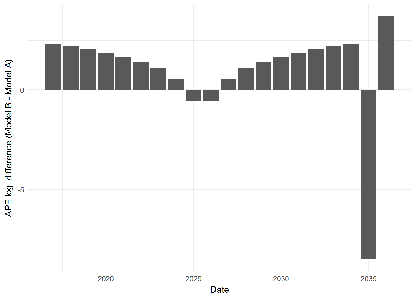
By transforming the scores to the logarithmic scale, it is now symmetrical and bound between (\(-\infty\), \(+\infty\)). Thus, a very very bad prediction will not hog all of the visual space, but will instead occupy its proportionate share of the visual space along with a very very good prediction. (Or as xkcd would put it… I just took the easy way out… =D).