Volatility of revenue thoughts
October 28, 2017
R statisticsI did this bit of analysis for BMO Investor Relations a few years back while I was with BMO Capital Markets but I think it is still an interesting topic.
The quick summary is that BMO Investor Relations received a published report, as well as the data and analysis underpinning the report from one of the credit rating agencies. The rating agency analyst made some certain assertions about BMO’s revenue volatility, but it turns out that the statistical analysis used by the analyst was… questionable.
Before we get into that however, let’s first define some terms and some concepts so that we are all on the same page. Let’s start with… what is volatility?
Volatility definition
To me, volatility is best defined as:
Volatility is something unexpected happening…
So, for instance, the sun rises and sets every day. You can therefore say that the value changes from day to night constantly, but because the sun rising and setting is expected, this wouldn’t be a cause for volatility. If you were to ask me to predict whether the sun would rise tomorrow, I would with 100% certainty say “YES!”. Indeed, if the opposite were to happen, then an unfathomable catastrophe would have instead occurred.
Now, let’s introduce some data to move this discussion from a purely theoretical one. We shall use three companies to illustrate this:
- Company A (A) - a consistent growth company
- Company B (B) - a consistent no growth company
- Company C (C) - an inconsistent no growth company
A <- c(100,110,120,130,140,150) %>%
        data.frame(Date = zoo::index(.),
                   Revenue = .,
                   Company = "A")

B <- c(125,125,125,125,125,125) %>%
        data.frame(Date = zoo::index(.),
                   Revenue = .,
                   Company = "B")

C <- runif(6, min = 100, max = 150) %>%
        data.frame(Date = zoo::index(.),
                   Revenue = .,
                   Company = "C")

company <- rbind(A, B, C)
Visualizing the above data points shows this:
ggplot(company, aes(x = Date, y = Revenue)) +
        geom_line() +
        facet_grid(. ~ Company) +
        theme_minimal()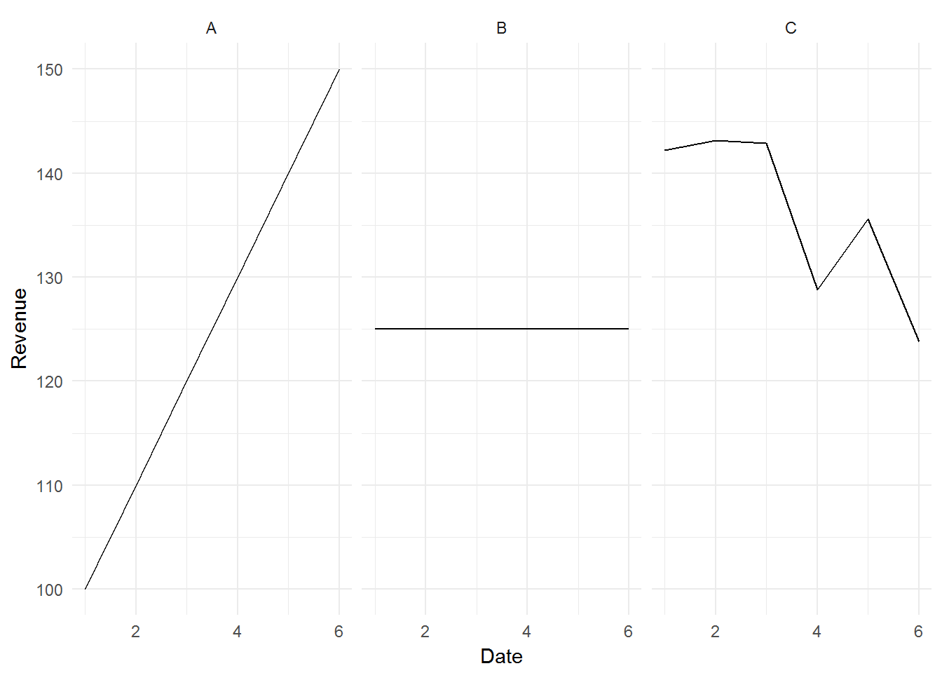
Intuitively, based on the above definition, we would conclude that Vol(A) = Vol(B) = 0, and Vol(C) > Vol(A) & Vol(B).
Using standard deviation as our quantitative measure of volatility, let’s see what happens if we calculate the standard deviation of A, B, C directly:
data.frame(A = round(sd(A$Revenue),0),
           B = sd(B$Revenue),
           C = round(sd(C$Revenue),0))
## A B C
## 1 19 0 8The above result violates our intuitive understanding that Vol(A) = Vol(B), since the standard deviation of A is not the same as the standard deviation of B. This is because A is a trending series.
We need to transform our series of numbers to remove the trend. We can do this by taking the first difference of all three companies (i.e. we look at the change in the original numbers for A, B, C).
# Transform data
A$Rev.transform <- c(NA, diff(A$Revenue))
B$Rev.transform <- c(NA, diff(B$Revenue))
C$Rev.transform <- c(NA, diff(C$Revenue))

company.transform <- rbind(A, B, C)

# Plot data
ggplot(company.transform, aes(x = Date, y = Rev.transform)) +
        geom_line() +
        facet_grid(. ~ Company) +
        ylab("Revenue Change") +
theme_minimal()![]()
The above graphs show that A has been increasing their results by 10 every year, B has no change to their results every year, and C has a variable change to their results every year.
Now, if we repeat our standard deviation calculation on the first differenced results, we will get a quantitative measure of volatility that doesn’t violate our intuition.
data.frame(A = round(sd(A$Rev.transform, na.rm = T),0),
           B = sd(B$Rev.transform, na.rm = T),
           C = round(sd(C$Rev.transform, na.rm = T),0))
## A B C
## 1 0 0 9Example of inappropriate volatility measurement
Now we can finally address the report.
Moody’s published a report in 2014 concluding that BMO has the most volatile revenue between RBC and National Bank:
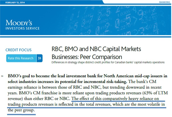
Moody’s Report
Let’s take a look at the data that Moody’s used to arrive at their conclusion:
# Load data
BMO <- read_excel("../../data/volatility/moody.data.xlsx", sheet = "BMO")
RBC <- read_excel("../../data/volatility/moody.data.xlsx", sheet = "RBC")
NBC <- read_excel("../../data/volatility/moody.data.xlsx", sheet = "NBC")

BMO <- ts(BMO[2], freq = 4, start = 2004.75) %>% data.frame(Revenue = ., Date = index(.))
RBC <- ts(RBC[2], freq = 4, start = 2004.75) %>% data.frame(Revenue =., Date = index(.))
NBC <- ts(NBC[2], freq = 4, start = 2004.75) %>% data.frame(Revenue =., Date = index(.))

BMO$Bank <- "BMO"
RBC$Bank <- "RBC"
NBC$Bank <- "NBC"

Banks.data <- rbind(BMO, RBC, NBC)

# Plot data
ggplot(Banks.data, aes(x = Date, y = Revenue)) +
        geom_line() +
        facet_grid(. ~ Bank) +
        scale_y_continuous(labels = dollar_format()) +
        theme_minimal()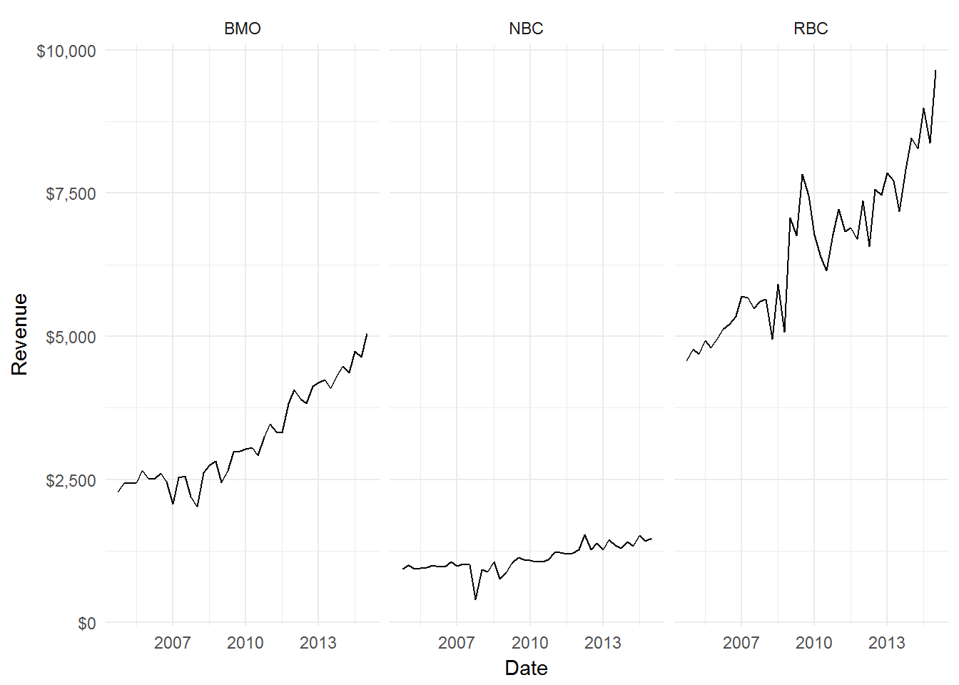
Visually, it doesn’t appear that BMO revenues exhibit the highest volatility, but I concede that it’s hard to definitively say based on visual inspection.
Let’s proceed with our prior established method of transforming our data to remove the trend and calculate the volatility of our revenues. (Moody’s compared volatility on the coefficient of variation instead of the standard deviation, we shall do the same to be consistent. The CV is simply sd / mean).
# Data transform
BMO$Rev.transform <- c(NA, log(BMO$Revenue) %>% diff())
RBC$Rev.transform <- c(NA, log(RBC$Revenue) %>% diff())
NBC$Rev.transform <- c(NA, log(NBC$Revenue) %>% diff())

Banks.data <- rbind(BMO, RBC, NBC)

# Visualize data transform
ggplot(Banks.data, aes(x = Date, y = Rev.transform)) +
        geom_line() +
        facet_grid(. ~ Bank) +
        scale_y_continuous(labels = comma) +
        ylab("Logarithmic Change in Revenue") +
        theme_minimal()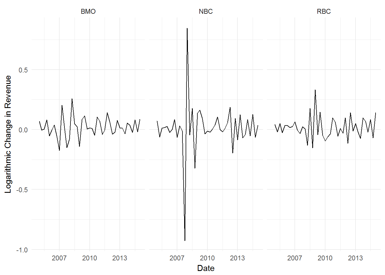
No trend is visible now. We can proceed with our volatility calculation:
data.frame(BMO = sd(BMO$Rev.transform, na.rm = T) /
                   mean(BMO$Rev.transform, na.rm = T) %>%
                   exp() %>%
                   round(4),
           RBC = sd(RBC$Rev.transform, na.rm = T) /
                   mean(RBC$Rev.transform, na.rm = T) %>%
                   exp() %>%
                   round(4),
           NBC = sd(NBC$Rev.transform, na.rm = T) /
                   mean(NBC$Rev.transform, na.rm = T) %>%
                   exp() %>%
                   round(4)
)
## BMO RBC NBC
## 1 0.08282807 0.09006692 0.2177954Voila. BMO revenue did in fact exhibit the lowest volatility compared to RBC and NBC.
Let’s now return to Moody’s analysis methods. Moody’s proceeds to calculate the mean, standard deviation, and the coefficient of variation (sd / mean) of the three banks without regard to whether the number series is trending or not.
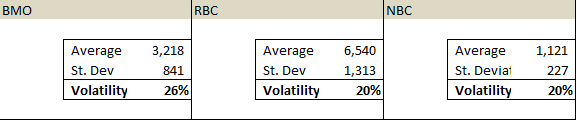
Moody’s Analysis
We can recalculate those numbers just to be sure:
data.frame(Moody.BMO = sd(BMO$Revenue) / mean(BMO$Revenue) %>% round(4),
           Moody.RBC = sd(RBC$Revenue) / mean(RBC$Revenue) %>% round(4),
           Moody.NBC = sd(NBC$Revenue) / mean(NBC$Revenue) %>% round(4)
)
## Moody.BMO Moody.RBC Moody.NBC
## 1 0.2614868 0.2007567 0.2021072This is an example of what happens when you fail to adjust for trending series.